Graphic design is both an art and a science. But you don’t need to have a degree or be a professional designer to be able to make one. All you need is to understand the basic principles, and mastering them can help you create visuals that are both informative and visually appealing.
Basic Elements of Graphic Design
A graphic design is comprised of building blocks, and understanding each of them will enable you to combine them wisely. Here are the basic elements of graphic design:
Line
Lines are the foundation of graphic design. They connect points, divide space, and draw the eye to specific areas. You’ll find various types of lines – thick, thin, wavy, or any shape you can imagine – each evoking a different mood.
Lines can be continuous or broken, straight or curved, smooth or zigzagged, and they do more than outline the content. It can convey movement and unify your composition. Keep an eye on thickness, texture, style, and color because these qualities can evoke different emotions and visual effects.
Color
Color is a fundamental cornerstone in graphic design. The backgrounds, lines, shapes, and every other graphic element in your composition have color.
Colors in graphic design are essential, as each one triggers different emotions and influences the overall feel of your design. But don’t be fooled into thinking that picking colors is a breeze. Some color combinations can clash and convey conflicting feelings. That’s why getting to know color theory is a essential – it helps you understand how colors work together.
What is Color Theory?
Colors grab attention, convey messages, and, of course, enhance aesthetics. We often make quick judgments based on color, deciding whether something is appealing, professional, pleasant, unattractive, or even peculiar in an instant.
When using colors, think about contrast. Contrast determines how effectively one color stands out against another. You can use contrasting colors to make text pop off its background, for instance. Complementary colors, like yellow and purple or blue and orange, create maximum contrast when used together.
Contrast also serves as a guide, directing people’s actions and highlighting what you want them to do. If you aim to boost “click-through” rates, ensure there’s a clear contrast between your call-to-action button and the rest of the design.
To evaluate color contrast, a color wheel is a handy tool. It visually shows how colors are related. For instance, complementary colors are positioned opposite each other on the wheel.
Colors also convey meaning. A green button typically indicates a positive action, like “OK” or “Accept.” But if you design a large “Accept” button in red, it might confuse users.
Let’s delve into common colors used by brands and the feelings they evoke among their audience:
- Red: This color can trigger powerful emotions, both positive and negative. It creates a sense of urgency, which is why it’s effective in sales. Red also stimulates appetite, making it a staple in the fast-food industry.
- Orange: Often associated with light-heartedness and fun, orange suits brands with a less “corporate” vibe. Darker shades of orange are linked to autumn and more “earthy” brands.
- Green: Gentle on the eyes and synonymous with health, green is a go-to for promoting health products, pharmaceuticals, and food brands. It can also represent growth and power in financial or military organizations.
- Blue: A calming and rational color, blue is widely used for its associations with strength, wisdom, and trust. It’s a safe choice for brands, but they should consider how it sets them apart in their field.
- Pink: Historically associated with femininity, pink is now embraced by mainstream brands regardless of their audience. It conveys youth, comfort, and hope, making it a versatile choice.
- Black: Black originally symbolizes luxury and power. But when paired with a splash of vibrant color, it can exude sophistication and energy. It’s a natural fit for fashion but may not suit all industries, like healthcare.
- White and Silver: These colors represent cleanliness and modernity. White, in particular, complements other dominant colors, offering a clean and minimalist appearance when used wisely.
Understanding how colors work and the emotions they evoke is a game-changer, helping you harness the power of color to create compelling and meaningful visuals.
Shape
Shapes are powerful tools for visually communicating ideas. They interact with each other to convey messages, and you’ll find real-world examples of this in street signs and symbols. Shapes often form the foundation of design projects, helping you organize and separate content.
Shapes are the fundamental elements with height and width, defined by boundaries like lines, colors, or the spaces in between. In a way, everything you see in design is a shape.
In graphic design, shapes can be constructed in two ways:
1. Geometric shapes: They are shapes made with tools using rulers or compasses. They are created with geometric precision, bringing a sense of control and order to your design, whether they’re simple or intricate.
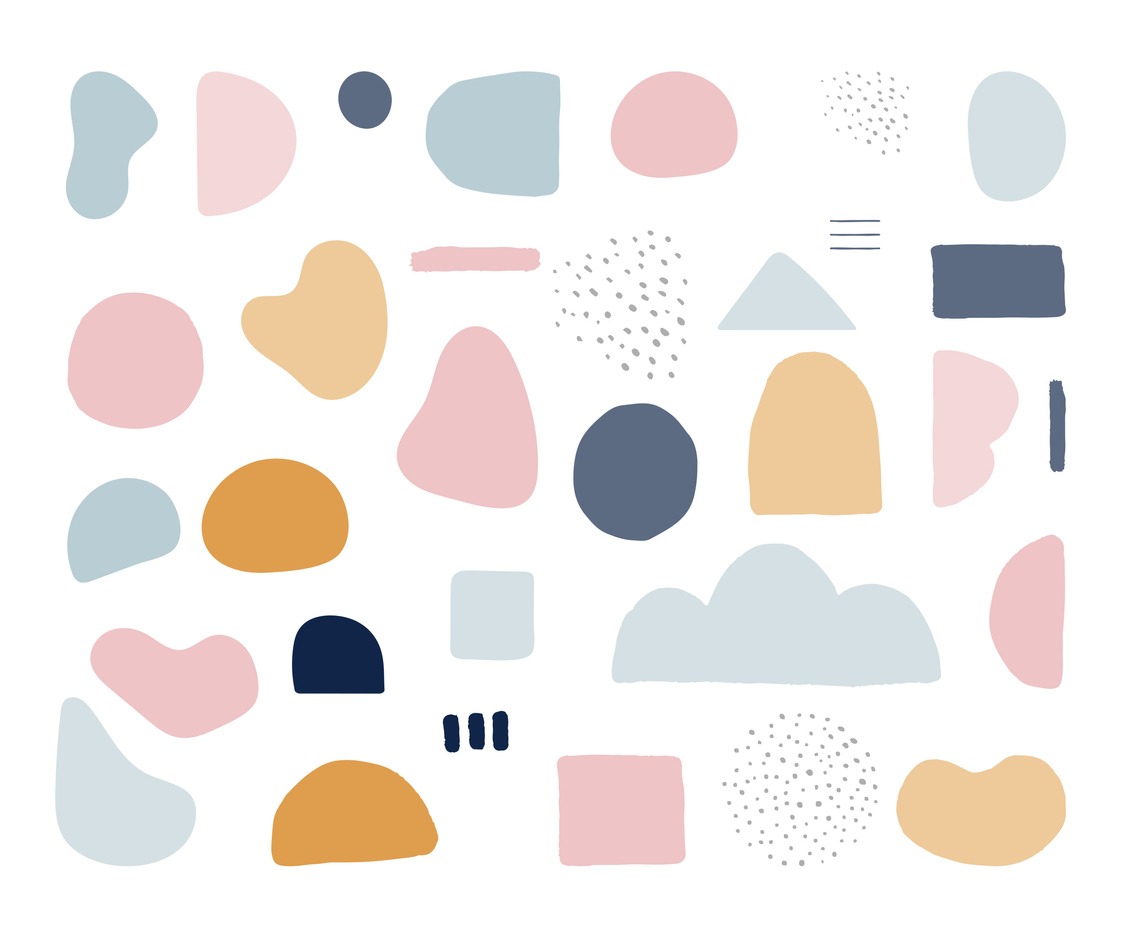
2.Organic shapes: These shapes are freeform, giving a natural feel. They can be drawn freehand and often resemble forms found in nature, which is how they got their name. They bring an organic, less structured vibe to your design.
Size
Size is another crucial element in graphic design. Some elements are enlarged or made bigger to quickly grab your attention, and those of lesser importance are made smaller. For instance, in a food packaging, the brand name and image is emphasized through size, while other elements like the ingredients are made smaller. Size, or scale, is a tool that designers use to create dynamic and eye-catching projects.
Scale and size come into play with shapes, lines, typography, and other design elements. They add variety to your composition and prevent your designs from becoming dull.
Texture
Graphic design is a visual medium, and since you can’t physically touch the projects (unless you’re working on packaging), conveying the look and feel is crucial. That’s where textures in graphic design come into play. Texture represents the physical quality of a surface, and we mimic this feeling through illustrations or images that portray the desired surface.
Texture adds depth to your designs by bringing out the surface quality. There are various ways to incorporate texture in graphic design, such as creating your own brushes to give texture to lines, crafting patterns, using opacity masks for grainy textures, or blending colors. Keep in mind that adding texture to illustrations can be demanding on your computer’s resources, so ensure you have the right tools at your disposal.
People remember how certain things feel, so when they see texture images in graphic design, they can almost sense the object’s touch because they already know how it feels in real life. Just remember not to go overboard with textures, as too much can overwhelm the viewer.
Space
Space is a crucial graphic element, often underestimated, and sometimes novice graphic designers have “horror vacui” (the fear of empty space) and avoid blank spaces altogether. Space in graphic design refers to the area around visual elements within a design project.
Positive space can recede as your eyes move through the design, giving the eye a break and drawing attention to other graphic elements in the composition. On the other hand, negative space can direct direct attention toward a shape in the background, like the hidden arrow in the FedEx logo.
Typography
Typography is another important element, as many designs include text. It’s all about the style and appearance of the text you use.
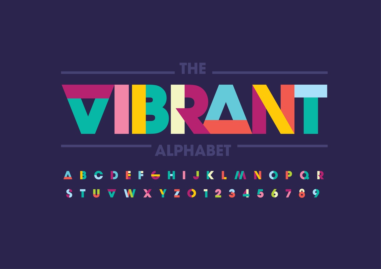
Just like colors, different fonts carry distinct feelings and convey various emotions. You’ll encounter playful, serious, elegant, minimalistic, and many other typography styles. However, it can be a challenge to strike a balance between using a stylish font to convey a specific tone and choosing something easily readable by all.
You’ll also come across “Serif” and “Sans-serif” fonts. Serif fonts have small decorative lines added to characters, while sans-serif fonts lack these lines. Serif fonts enhance text readability, making them suitable for blogs, articles, or newspapers. For headings, consider using a bold sans-serif font in a larger size and adjust the text’s emphasis according to its priority.
Choosing a font to use can be tricky, so here are some tips you may want to remember:
- For headers, display typefaces often draw the most attention. However, they can be distracting and challenging to read if used for lengthy text blocks. Therefore, for body text, it’s wise to stick to serif or sans-serif fonts, as they are more legible.
- When mixing fonts, some experts suggest sticking to two or three different styles, while others encourage greater diversity in typefaces. The key to mastering typography in graphic design is choosing fonts with a shared characteristic to maintain visual coherence. Limit the use of fonts to two or three families on a single webpage.
- Familiarize yourself with the concept of font families, which group fonts with shared design styles. For example, Roboto is a family that includes bold, italic, or thin styles.
- Avoid adding text directly to images, especially in web design. It’s better to work with your web team to overlay responsive text on images. Text on images can be challenging to read on mobile devices, and it doesn’t support automatic translation.
- If you do need to include text in social media or blog images, ensure there’s enough color contrast for readability. A quick tip to improve background color contrast is to darken the border.
- Regardless of the typeface you choose, make sure it offers variations in size, weight, and thickness. For instance, if you want to use small caps, make sure the font provides this option rather than simply reducing the size.
- You can also make bold decisions about how and where you position your text. For instance, using a dropped capital letter can provide a literary feel. To excel in typographic composition, anchor your text to a grid and align it with other elements on the page.
Keep in mind that you can customize your chosen font by:
- Adjusting line spacing (leading).
- Expanding or condensing the space between characters (tracking), but they tend to be used for capital letters only.
- Altering the spacing between specific characters (kerning), but these are typically reserved for headers in display fonts.
Remember that it’s the combination of the image, your message, and how it’s presented, including the fonts you use, that can make the difference in effectively reaching your audience.
Imagery
They say a picture is worth a thousand words, and harnessing the power of images can greatly enhance the impact of your message. To make the most of imagery, your first decision is whether to incorporate a touch of reality with a photograph, visualize key information with an illustration, or use icons to help viewers digest your message.
For a cohesive design, choose images that are contextually relevant, convey the right message and tone, and exude authenticity. This means avoiding overly posed stock photos, low-resolution images, and anything that might be confusing within the context of your design.
Image quality is paramount, especially for e-commerce. When customers shop online, they rely on high-quality images with intricate product details. Subpar images are not enticing, and can lead to a negative impression of the product.
Once you’ve chosen your image, there are several ways to manipulate it:
- Cropping: Adjusting the framing by cropping can create a more abstract or intimate feel, depending on how close you crop.
- Framing and Positioning: Using a border makes the image seem like a separate object within the design, while a full-bleed image that extends to the margins provides a more immersive and immediate effect.
- Color Editing: Modify the image’s coloring to align with the tone and color scheme of other graphic design elements.
In today’s digital landscape, mobile devices drive a significant portion of web traffic. It’s crucial to test your graphics on mobile to ensure they appear appropriately on smaller screens. Suppose they don’t, consider creating a separate version of your graphics tailored to mobile users.
Graphic Design Principles
Now that you’ve familiarized yourself with the graphic design elements, the next step is to learn how to bring them together in a harmonious composition. Here are some principles to keep in mind:
Alignment
A great starting point for your graphic design is to work within a grid that already sets up margins. This grid serves as the foundational structure of your piece, providing essential guidelines for organizing your design. As you begin placing various design elements, ensure they align with each other and with the grid.
Alignment in graphic design also determines the placement of different elements on a page and whether they form visually cohesive groups. For instance, a designer typically wouldn’t choose to left-align an article title and right-align the body text because it could create a disconnection between them.
Hierarchy
At its core, hierarchy is all about emphasizing certain elements and determining where viewers’ eyes are naturally drawn. For example, titles are usually larger than the body text, emphasizing their importance in the design.
Establishing a visual hierarchy brings order to your design and help viewers quickly understand your content. Instead of resorting to large fonts (which can feel overpowering), you can create a sense of hierarchy by using subtle cues.
Here are some straightforward methods to create a visual hierarchy:
- Scale: The eye is naturally drawn to the largest element, so strategically position the most critical element where you want your audience to focus first.
- Color and Contrast: Utilize bright or contrasting colors for essential information and opt for muted colors for elements you want viewers to perceive as secondary.
- Contrasting Styles and Shapes: Capture attention by introducing a style or shape that stands out and feels distinct from the rest of the design.
Composition
After deciding on your colors, imagery, and fonts, the next step is to arrange them in a way that maximizes the impact of your design. Your aim should be to create a design that is clean and elegant, removing any unnecessary clutter and visual distractions, so that users can focus on one task at a time.
Once you’ve eliminated unnecessary elements, it’s essential to ensure that all the content – including images, buttons, colors, shapes, and text – is organized clearly and logically.
Each element in your graphic design should have a specific purpose. As you create your design, ask yourself, “What is the purpose of this element? Does it guide the user, provide information, encourage further reading, prompt form filling, or simply convey information?” Even if you have multiple goals, prioritize one and make it unmistakably clear to the end user.
Balancing and Symmetry
Balance is crucial in determining whether a design feels organized or chaotic. The choice of balance type should align with the specific requirements of the project; some projects may benefit from simple symmetry, while others may demand a design that deliberately gives a sense of imbalance. It’s an often underestimated aspect of design, but it can greatly affect its impact. There are three types of balance:
- Symmetrical: In symmetrical balance, everything is evenly distributed and balanced. Humans tend to find symmetrical designs naturally pleasing.
- Asymmetrical: Asymmetrical balance involves elements of different sizes and shapes, creating a balanced design without strict symmetry. While less comfortable for the user, it can engage their attention for longer as they contemplate what they’re seeing.
- Radial: Radial balance arranges elements around a central point, drawing the viewer’s focus to the center of the image. This approach is particularly effective for icons and logos.
Contrast
Contrast revolves around differences, whether they’re big or small, bright or muted, sharp or soft. Designers use contrast to direct attention to a specific area or emphasize distinctions between images.
Movement
Movement encompasses not only the physical movement of design elements but also the movement of the viewer’s eye across the composition. For example, a curved line can guide the eye along a page, while a solid object can arrest the viewer’s attention.
Repetition
Repeated elements within a design play a major role in making the finished product cohesive. This is why some companies use a limited color palette across various aspects, from logo design to packaging. Consistent repetition of elements can provide comfort and orientation to viewers, while breaking the pattern can feel disruptive.
Conclusion
While graphic design is undoubtedly a creative endeavor, understanding how to apply the fundamental elements of good design is crucial to conveying your key message to viewers effectively. Rather than viewing these elements as rigid rules, it’s more helpful to see them as helpful tips and guidelines that can refine your work. After all, you must grasp the rulebook before you can break its rules.


